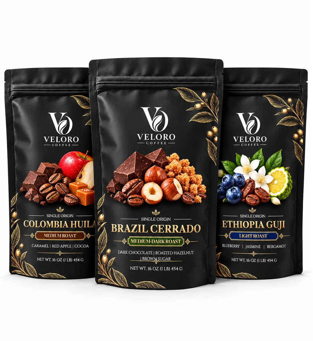
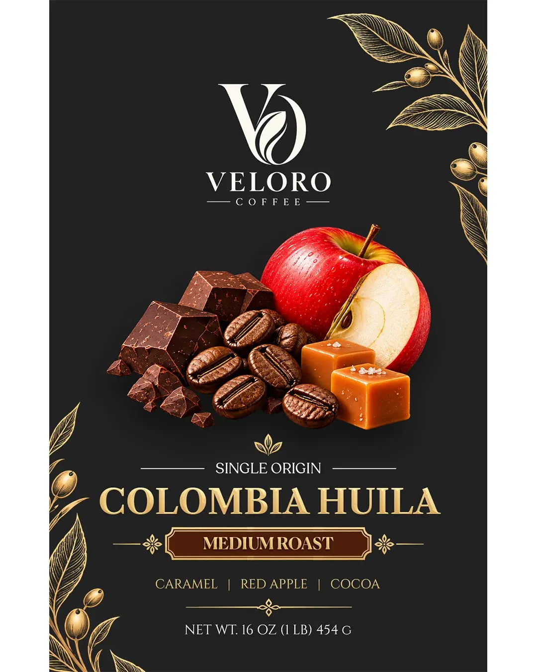
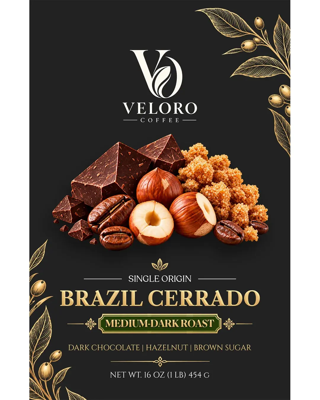
Veloro is a premium single-origin coffee packaging concept created for a three-origin series including Ethiopia Guji, Colombia Huila, and Brazil Cerrado.
The project was built around a simple but strong packaging system that could unify the full range while still giving each coffee its own distinct character. Through restrained typography, premium detailing, elegant botanical ornament, and origin-specific tasting cues, the packaging was designed to feel refined, shelf-ready, and easy to navigate at a glance.
Color Palette
Typography
Cinzel Canela Caslon
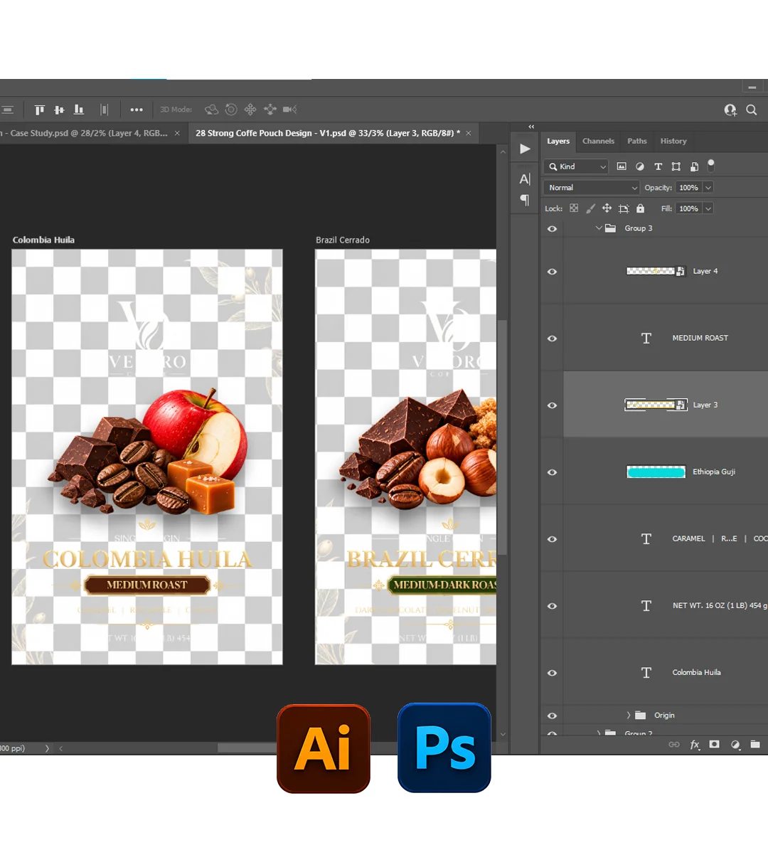
Tools Used
Deliverables
Brand Identity · Coffee Packaging · Label Design · Range System · Packaging Artwork
PROJECT TYPE
Concept Packaging
CATEGORY
Food & Beverage
PACKAGING
Coffee Bag / Coffee Label System
SCOPE
Branding · Packaging · Art Direction
YUMMY BRANDS
01 — Project Overview
A premium range built on consistency
Veloro was designed as a premium single-origin coffee series with a focus on clarity, elegance, and strong shelf presence. The goal was to create a visual system that could hold together multiple origins under one brand while still allowing each product to feel distinct and memorable. The concept includes three coffee origins — Ethiopia Guji, Colombia Huila, and Brazil Cerrado — each represented through its own roast level, tasting notes, and subtle color distinction. Rather than building three completely different designs, the system relies on a consistent structure that keeps the range visually connected and recognizable as one family.
YUMMY BRANDS
02 — The Challenge
Keeping the range unified without making it repetitive
Single-origin coffee packaging needs to communicate several things at once: the brand, the origin, the roast profile, and the tasting notes. The challenge in this project was to organize all of that information clearly while avoiding a result that felt either too generic or too visually busy. Another important challenge was differentiation. Since the series shares the same brand and overall layout, each coffee needed a subtle but effective way to stand apart. That distinction was created through tasting-note imagery and carefully chosen accent colors, allowing each pack to express its own character while maintaining a consistent premium identity across the range.
03 — Visual Direction
Elegant, premium, and shelf-ready
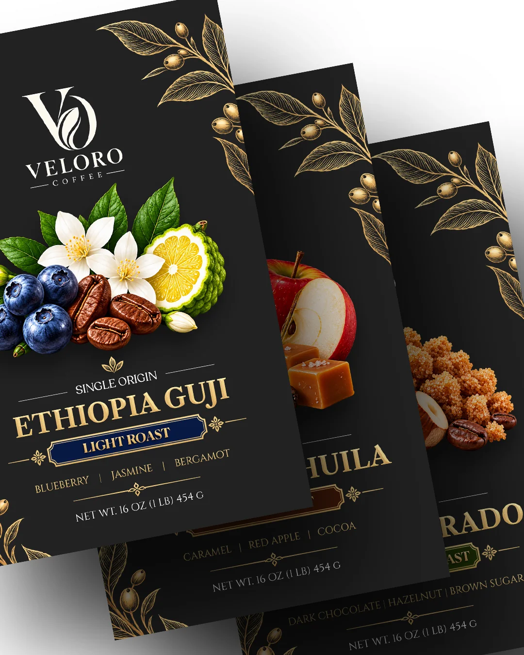
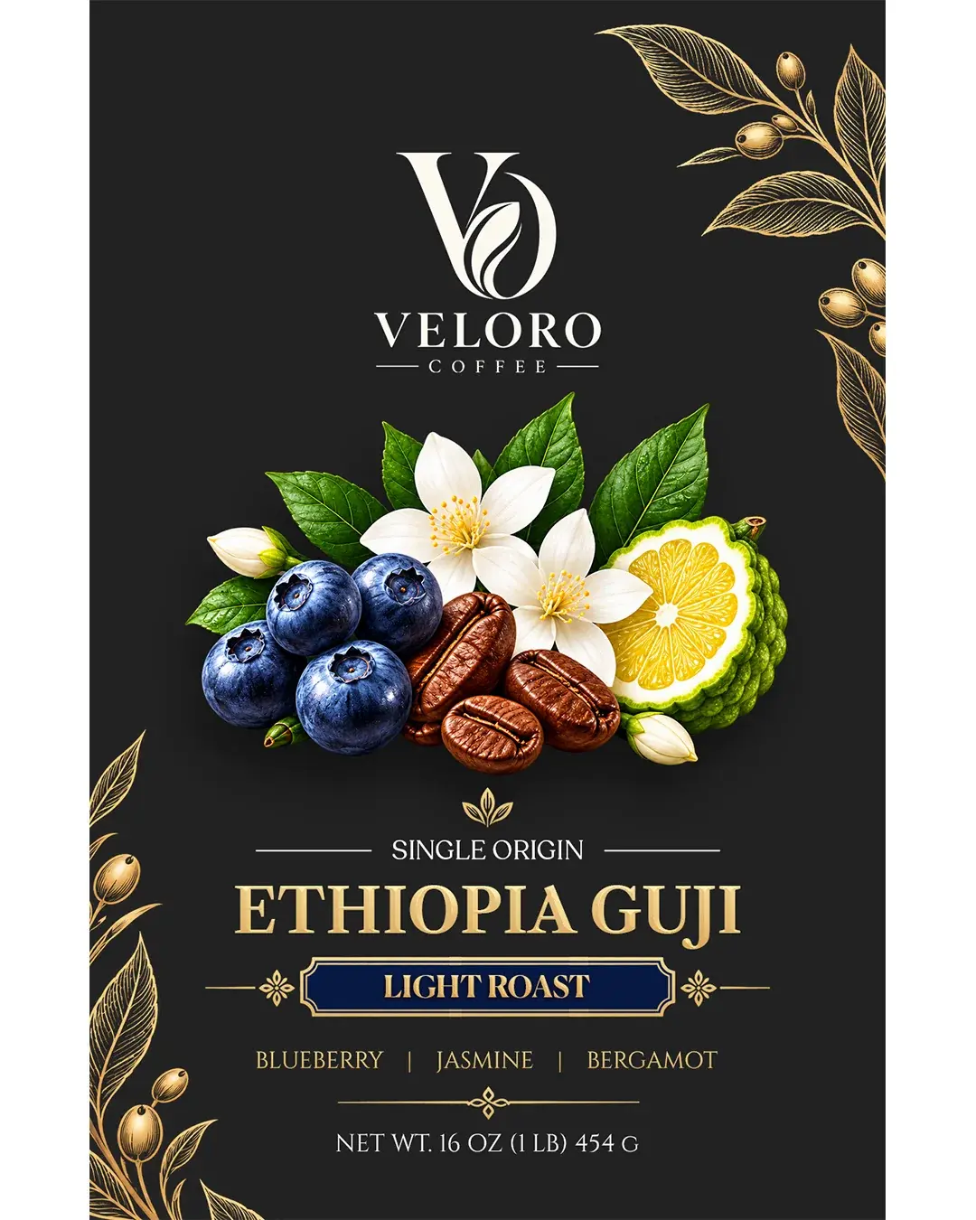
The visual direction was built around a dark premium base paired with warm gold detailing and classic typography. This contrast helps the packaging feel rich and sophisticated while also giving it strong visual impact on shelf. Botanical line art placed around the borders reinforces the natural and origin-driven positioning of the product, while the central ingredient compositions bring each coffee’s tasting profile to life in a more immediate and sensory way. The result is a packaging direction that feels elegant and distinctive without becoming overcomplicated.
04 — Range System
One structure, three distinct origins
A consistent packaging framework was developed for all three SKUs so the brand remains easy to recognize across the full series. The logo placement, hierarchy, typography, and main composition remain stable, creating a strong family resemblance. Within that structure, each coffee uses its own tasting-note imagery and accent color. Ethiopia Guji introduces a fresher and brighter character through notes of blueberry, jasmine, and bergamot. Colombia Huila feels warmer and smoother with caramel, red apple, and cocoa cues. Brazil Cerrado takes on a deeper and fuller personality through dark chocolate, hazelnut, and brown sugar notes. This approach keeps the range coherent while giving every pack a clear individual identity.