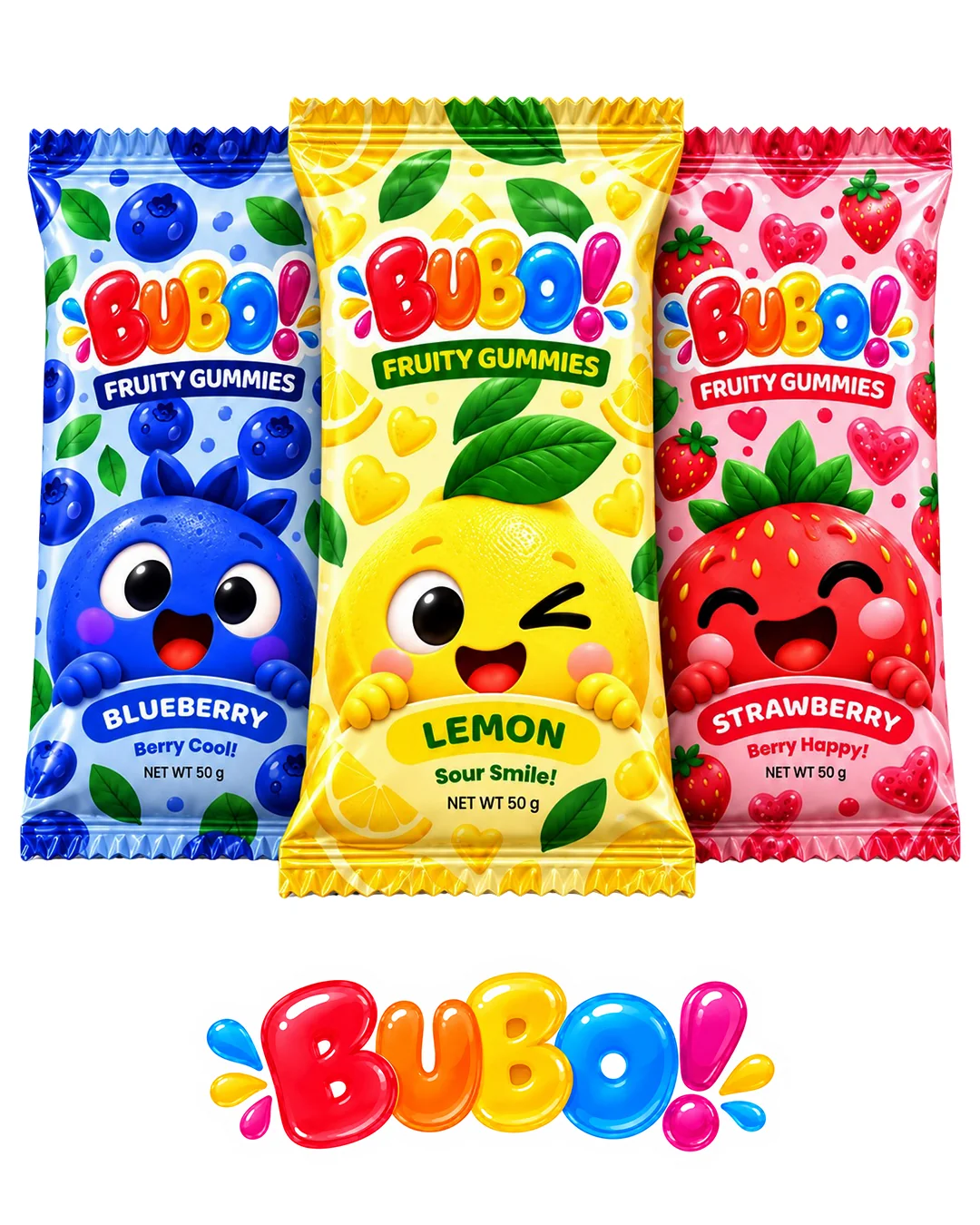
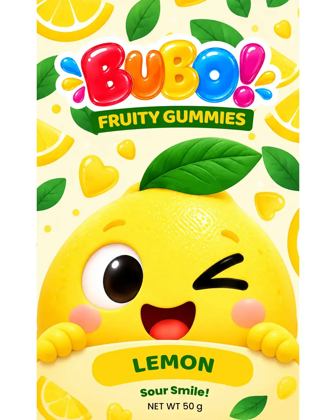
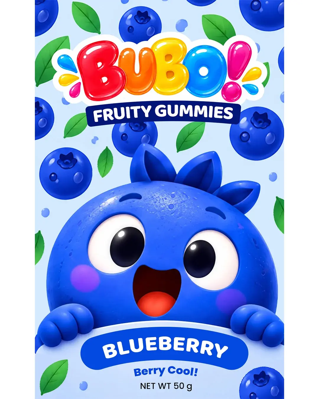
BUBO is a playful packaging concept created for a kids’ fruity gummies range featuring three bright and cheerful flavors: Blueberry, Lemon, and Strawberry.
The project focused on building a fun, character-driven packaging system that feels energetic, friendly, and easy to recognize on shelf. Each flavor was given its own mascot personality and color world, while a shared logo structure and packaging layout kept the range visually connected as one brand family.
Color Palette
Typography
Poppins
Baloo 2
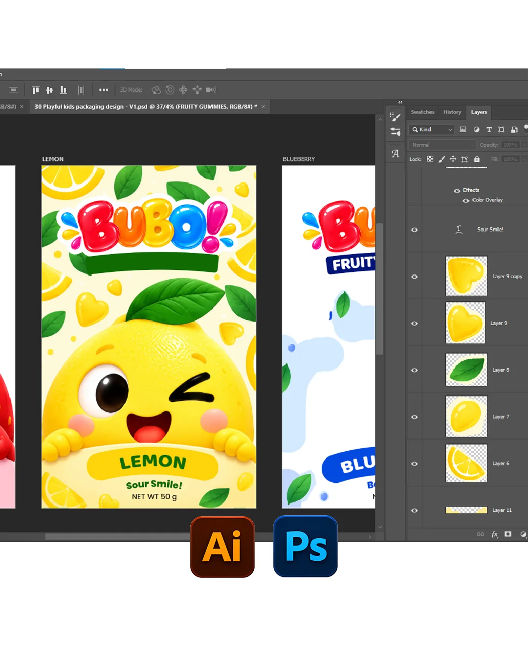
Tools Used
Deliverables
Brand Identity · Packaging Design · Character Design · Flavor System · Packaging Artwork
PROJECT TYPE
Concept Packaging
CATEGORY
Kids Snacks / Confectionery
PACKAGING
Pillow Pouch / Single-Serve Gummy Pack
SCOPE
Branding · Packaging · Character Design · Art Direction
YUMMY BRANDS
01 — Project Overview
A playful gummy brand with shelf impact
BUBO was designed as a cheerful fruity gummies concept for children, combining bold flavor differentiation, expressive mascot characters, and a bright visual system built for instant appeal. The goal was to create packaging that feels exciting and kid-friendly at first glance while still remaining organized, readable, and commercially believable. The brand identity is centered around fun, flavor, and emotional connection. Rather than relying only on color, the packaging uses mascot faces, fruit-inspired cues, and soft playful shapes to make each SKU feel memorable and easy to distinguish.
YUMMY BRANDS
02 — The Challenge
Designing for kids without losing clarity
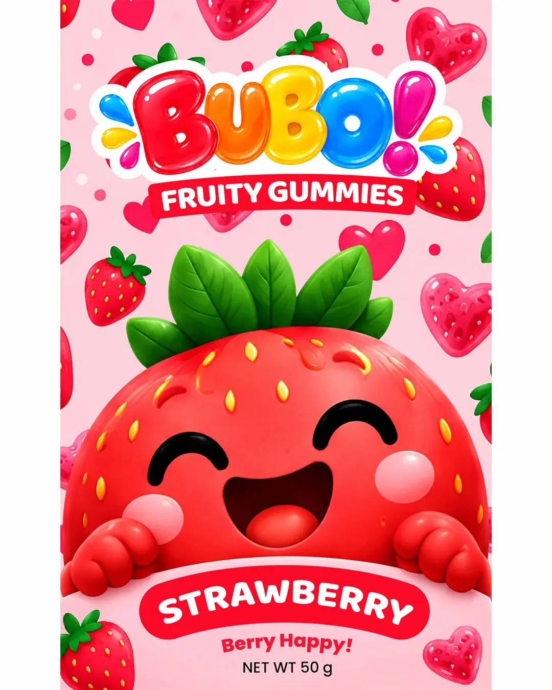
Kids’ snack packaging needs to grab attention quickly, communicate flavor instantly, and feel fun enough to create emotional appeal. At the same time, it can easily become too noisy if too many playful elements compete for attention. The challenge in this project was to build a character-driven design system that stays lively and expressive without becoming visually messy. A clear structure was developed to keep the BUBO logo, flavor name, character face, and supporting copy immediately readable, while the decorative fruit elements and candy-style details reinforce the playful tone around them.
03 — Visual Direction
Bright, cheerful, and character-led
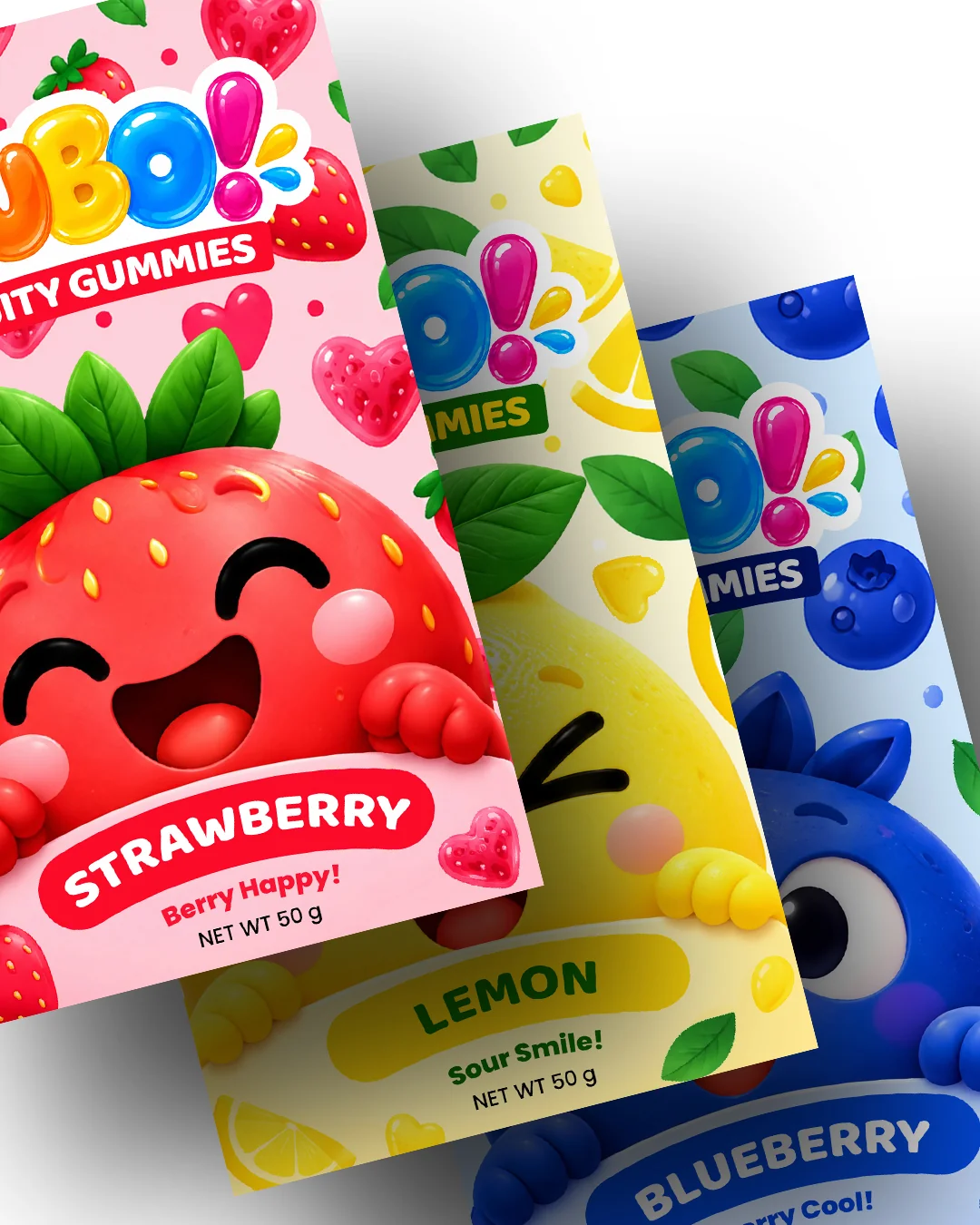
The visual direction for BUBO was built around a candy-like branding language with rounded forms, glossy letter styling, high-energy colors, and oversized character expressions. The logo was treated as a playful hero element, helping the brand feel fun and instantly recognizable. Each pack combines a clean overall structure with a high level of personality. Repeating fruit motifs, small playful shapes, and soft gradients help create a lively kids-focused atmosphere, while the central mascot design gives each flavor its own identity and emotional appeal.
04 — Flavor & Character System
One brand, three playful personalities
A key part of the concept was creating a unified packaging family across multiple flavors. Blueberry, Lemon, and Strawberry each have their own dominant color, fruit cues, and mascot expression, making flavor recognition fast and intuitive. Even though each pack has its own personality, the overall architecture remains consistent through the same logo placement, same pack structure, same hierarchy, and the same cheerful design language. This makes the lineup feel varied but still clearly connected as one brand system.