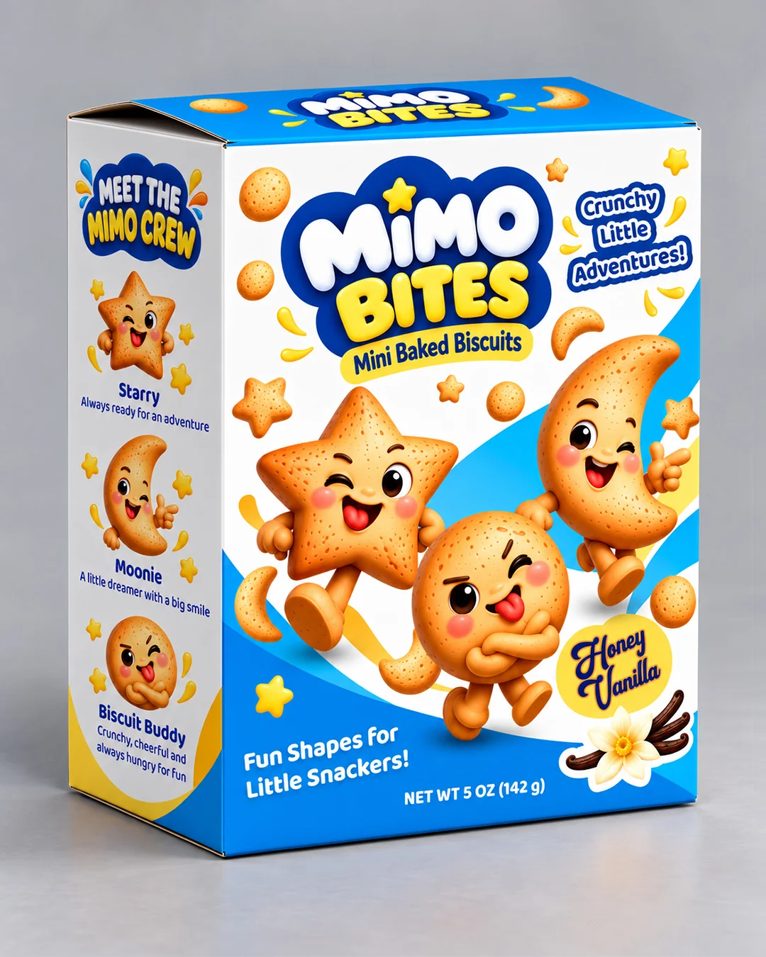
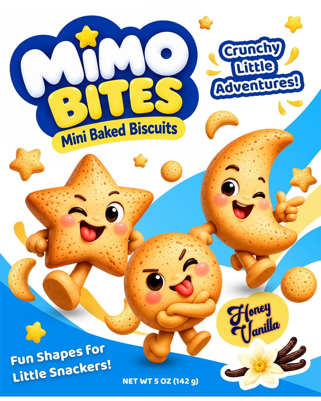
A playful packaging concept created for a kids’ mini baked biscuit brand, combining cheerful characters, bold typography, and a bright blue, yellow, and white visual system.
MIMO BITES was designed to turn everyday snack time into a small adventure — creating a fun and recognizable brand world that connects the product, packaging, and characters into one cohesive experience.
Branding · Packaging · Character Design · Illustration
YUMMY BRANDS
01 — Project Overview
Turning Snack Time into a Tiny Adventure
MIMO BITES is a playful kids’ snack brand created around mini baked biscuits in fun shapes. The project focused on building a bright and approachable packaging identity that could appeal to children while still keeping the product information clear and easy for parents to understand. The packaging combines expressive typography, cheerful biscuit characters, and a simple blue, yellow, and white color system to create an energetic brand world built around fun, movement, and everyday snack moments.
YUMMY BRANDS
02 — The Challenge
Making Kids Packaging Fun Without Losing Clarity
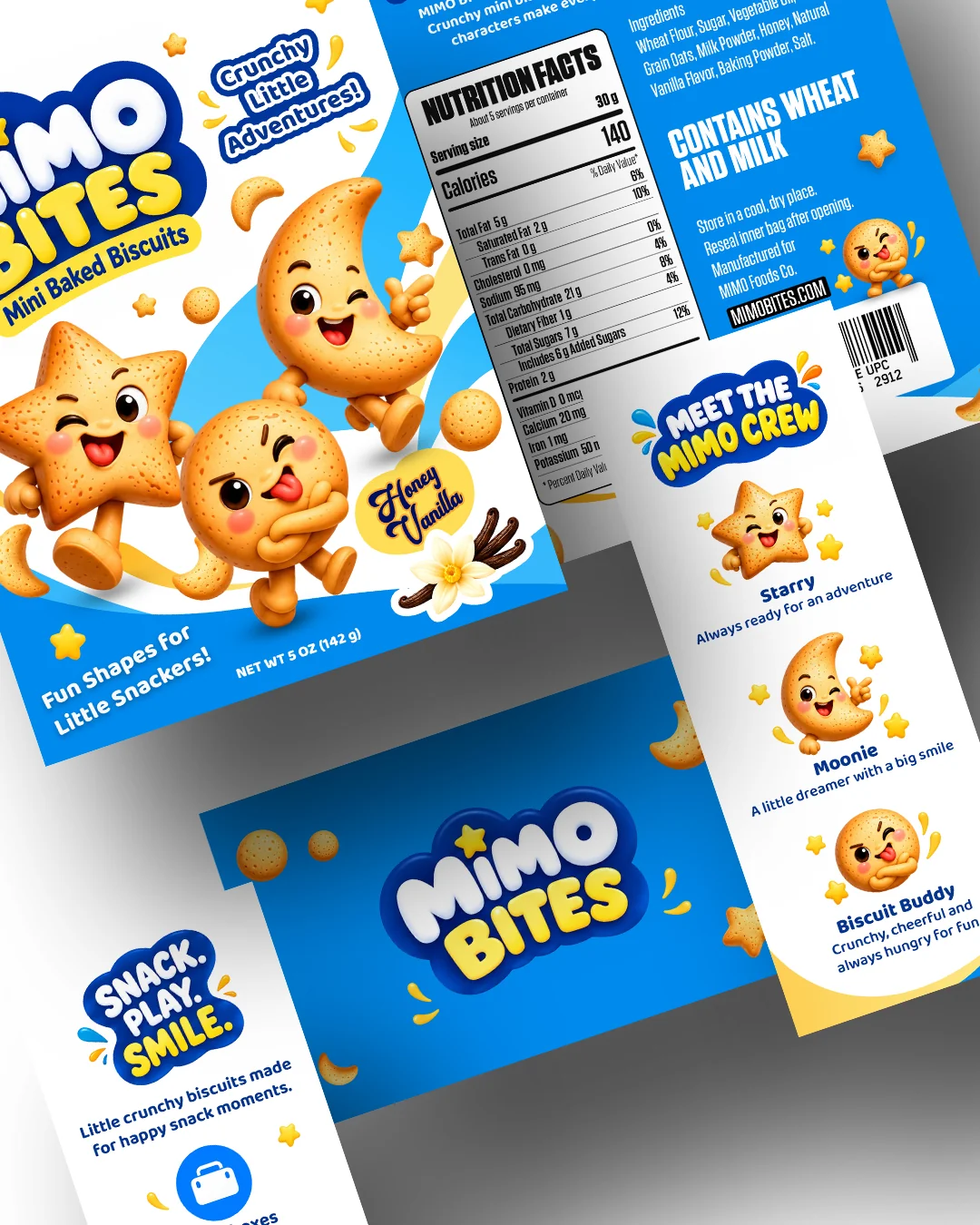
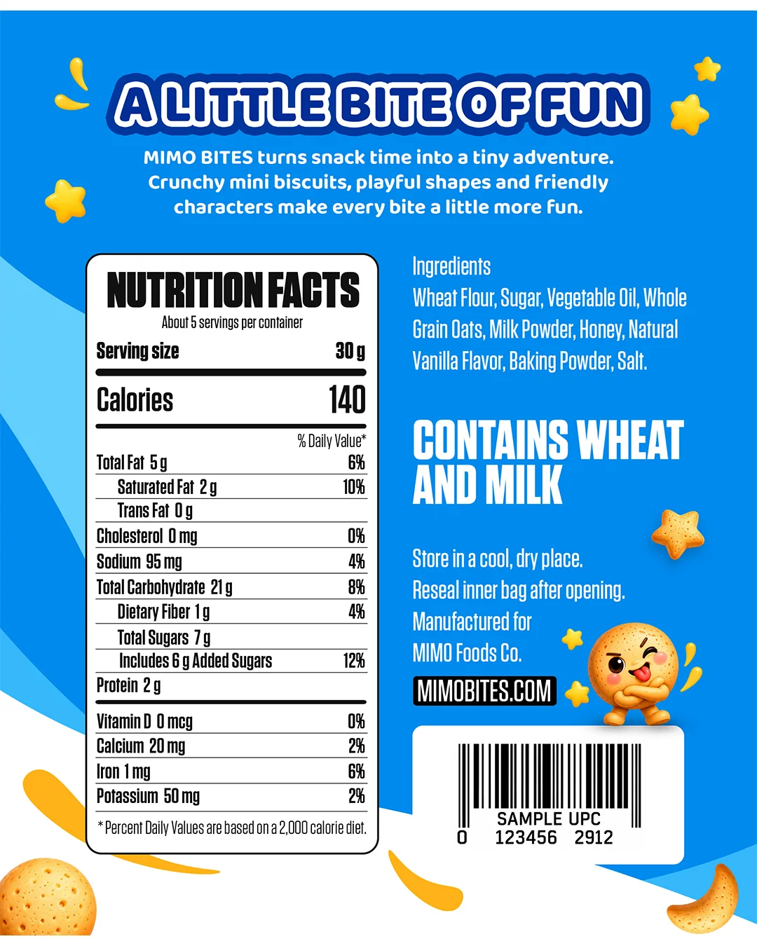
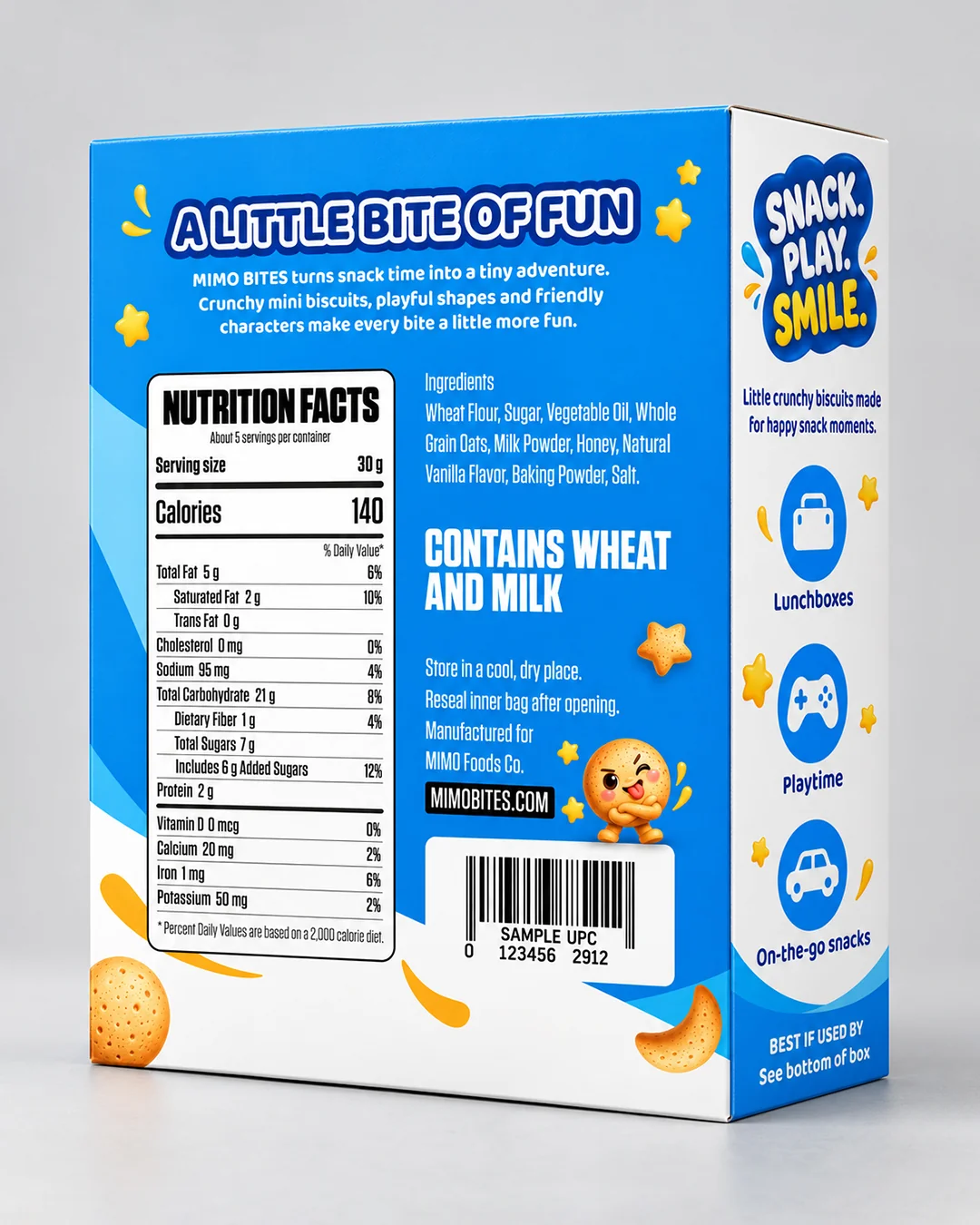
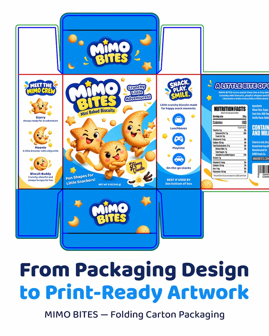
Kids’ packaging needs to capture attention quickly, but adding too many playful elements can easily make the design feel crowded or difficult to navigate. The challenge was to create a lively character-driven package while maintaining a clear hierarchy for the product name, nutrition information, ingredients, and practical product details. The solution was to give each surface of the carton a clear role. The front focuses on the product, characters, and flavor, while the side and back panels organize functional information, usage moments, and brand storytelling in a way that remains visually connected to the main design.
03 — Visual Direction
Bright, Friendly and Character-Led
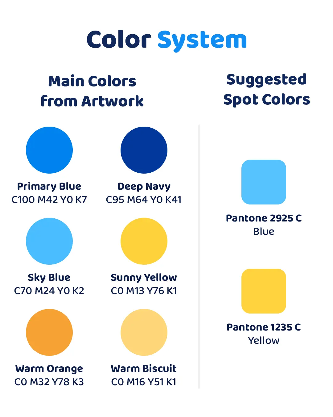
The visual direction was built around a cheerful and energetic kids’ snack identity. Bold blue and yellow tones create immediate recognition, while large rounded typography and soft graphic shapes give the packaging a friendly and approachable personality. Playful biscuit illustrations, curved compositions, and small decorative elements add movement throughout the packaging without competing with the main product communication. The result is a visual language that feels colorful, fun, and designed specifically for young snackers.
04 — Character System
Meet the MIMO Crew
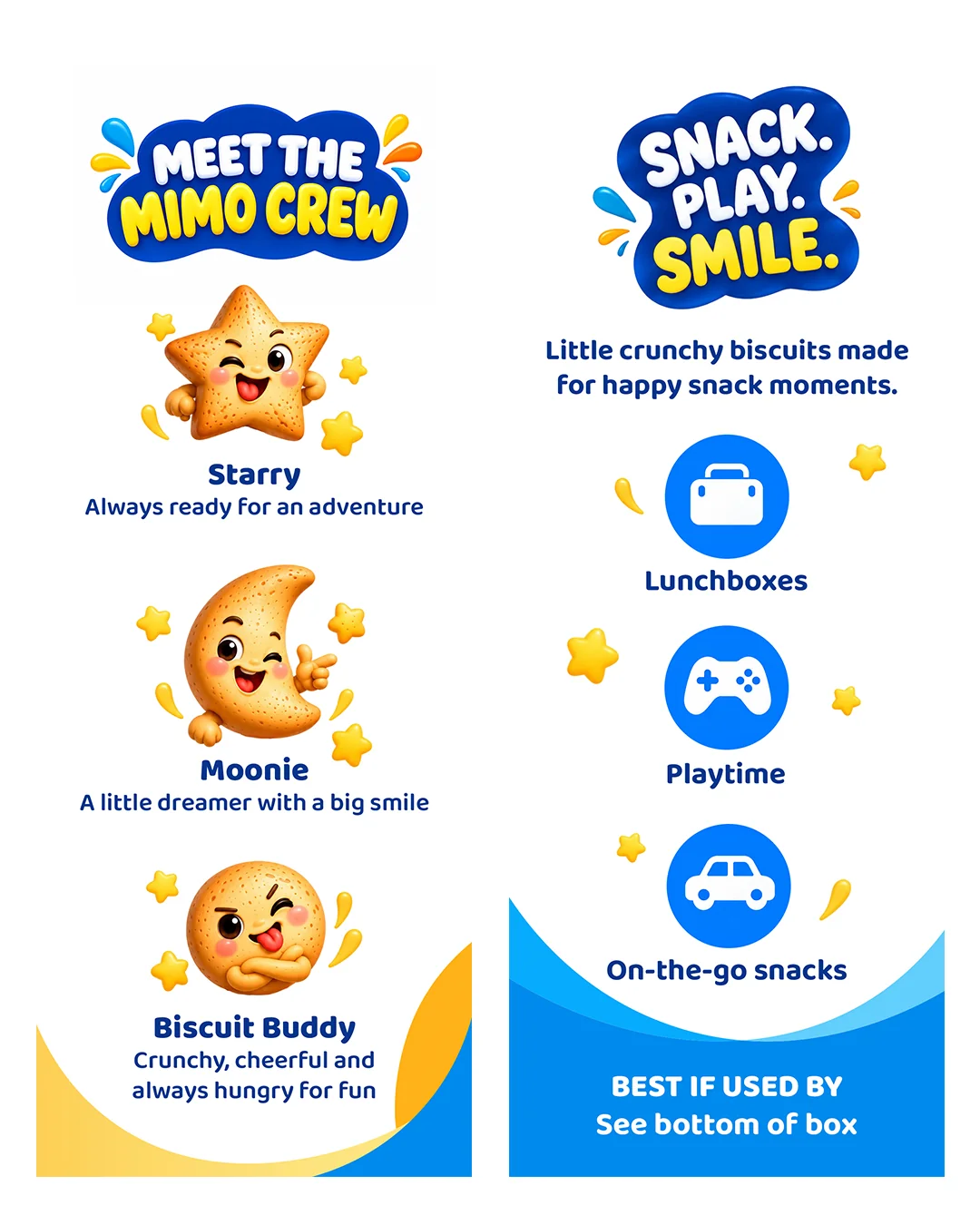
The character system plays a central role in the MIMO BITES identity. Three biscuit-inspired mascots — Starry, Moonie, and Biscuit Buddy — were created to give the brand a more memorable and expressive personality.
Each character has its own shape and attitude, allowing the packaging to communicate playfulness beyond the front panel. Together, they create a flexible visual system that can extend across packaging, social content, promotional graphics, and future product variations while keeping the brand instantly recognizable.
05 — Print & Production
From Design to Production Setup
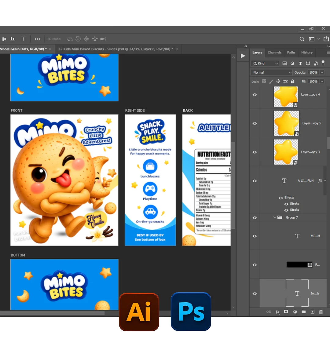
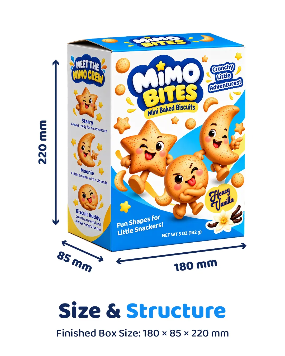
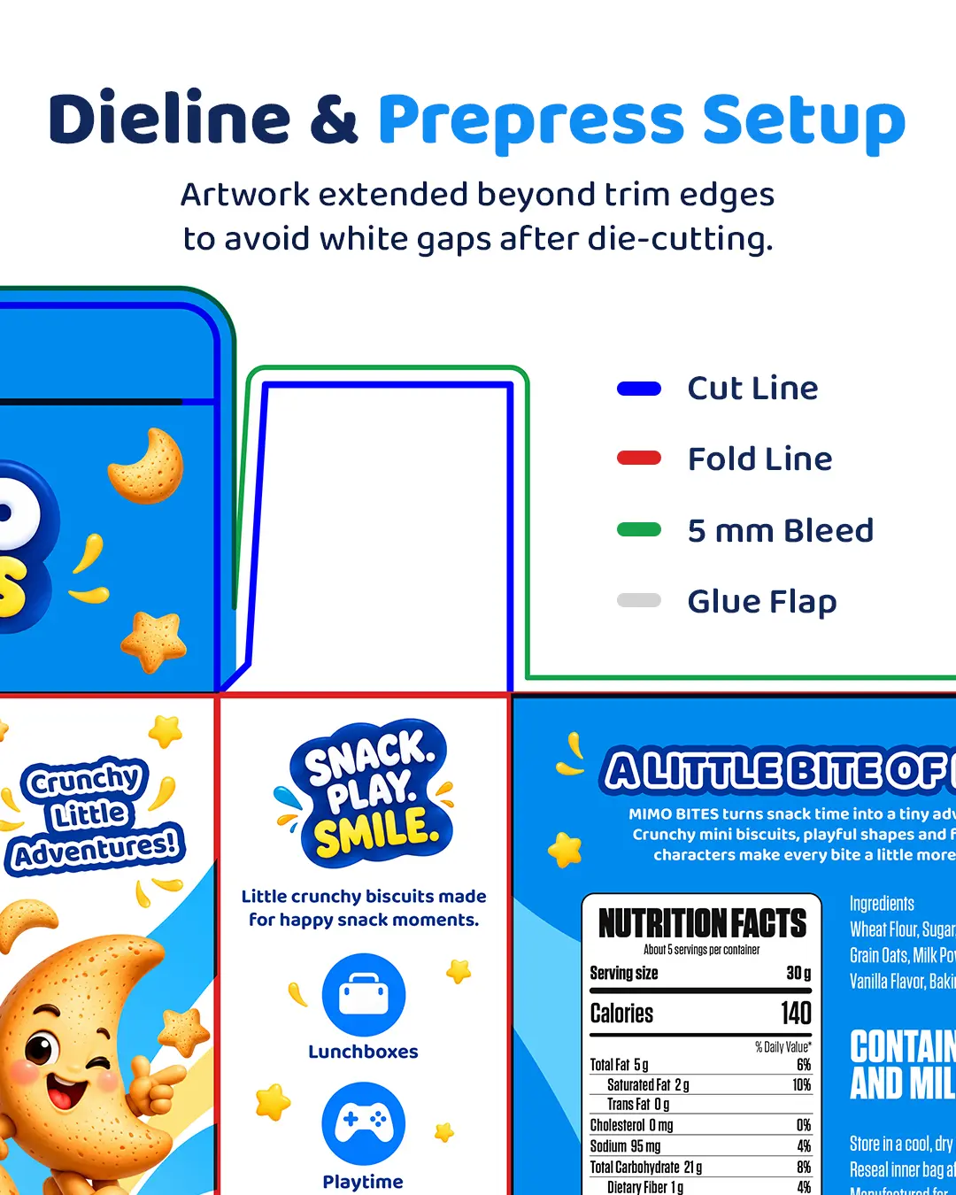
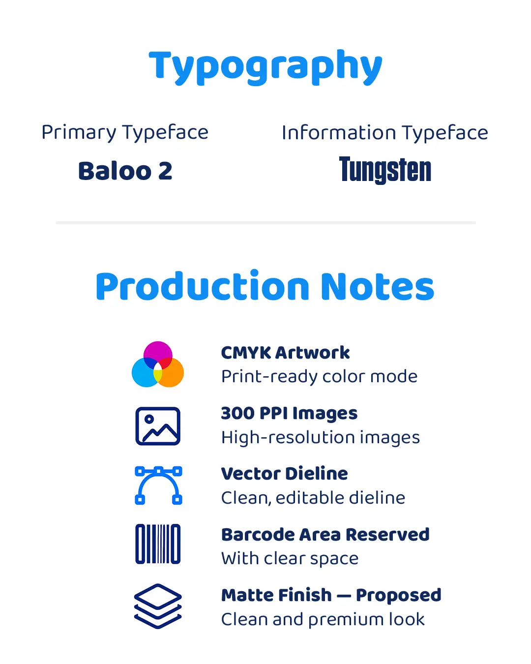
The MIMO BITES concept was developed beyond the visual design into a structured packaging production system. The presentation defines the finished carton size, folding-carton structure, dieline logic, cut and fold references, bleed area, color specifications, typography, and key prepress considerations.
These technical details show how the visual identity translates across the complete package while keeping the artwork organized for final supplier adaptation and print production.