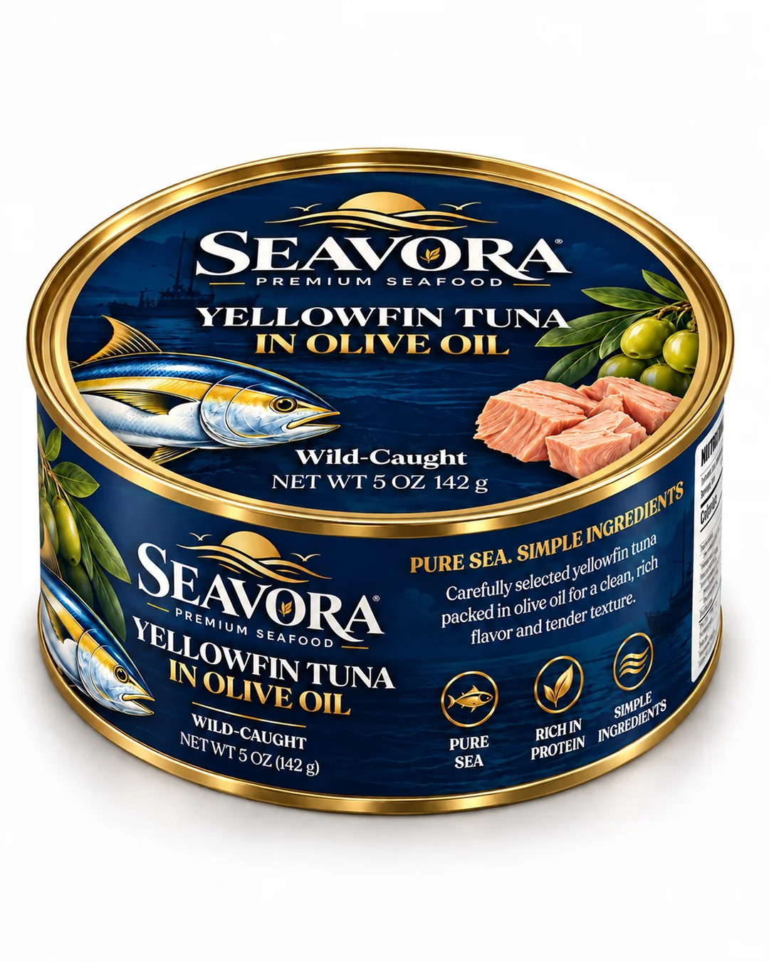
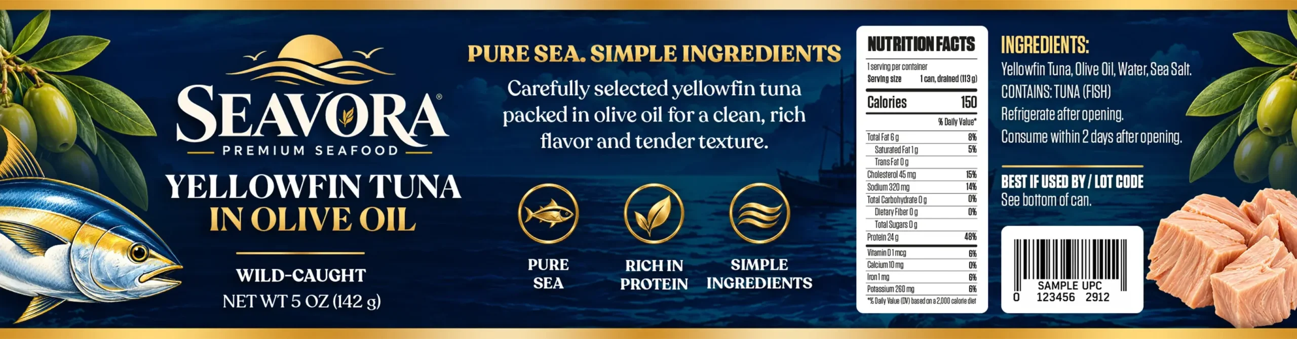
A premium packaging concept for yellowfin tuna in olive oil, combining deep navy, warm ivory, gold accents, and natural ingredient imagery.
The design extends across the wrap-around can label and custom lid artwork for a refined and cohesive packaging system.
Metal Can · Wrap-Around Label · Custom Lid Artwork
SCOPE
Branding · Packaging · Label Design · Art Direction
YUMMY BRANDS
01 — Project Overview
Bringing a Premium Feel to Everyday Seafood
SEAVORA is a premium yellowfin tuna packaging concept created to elevate a familiar canned-food format through a refined navy, ivory, and gold visual identity.
YUMMY BRANDS
02 — The Challenge
Elevating a Familiar Canned Food Format
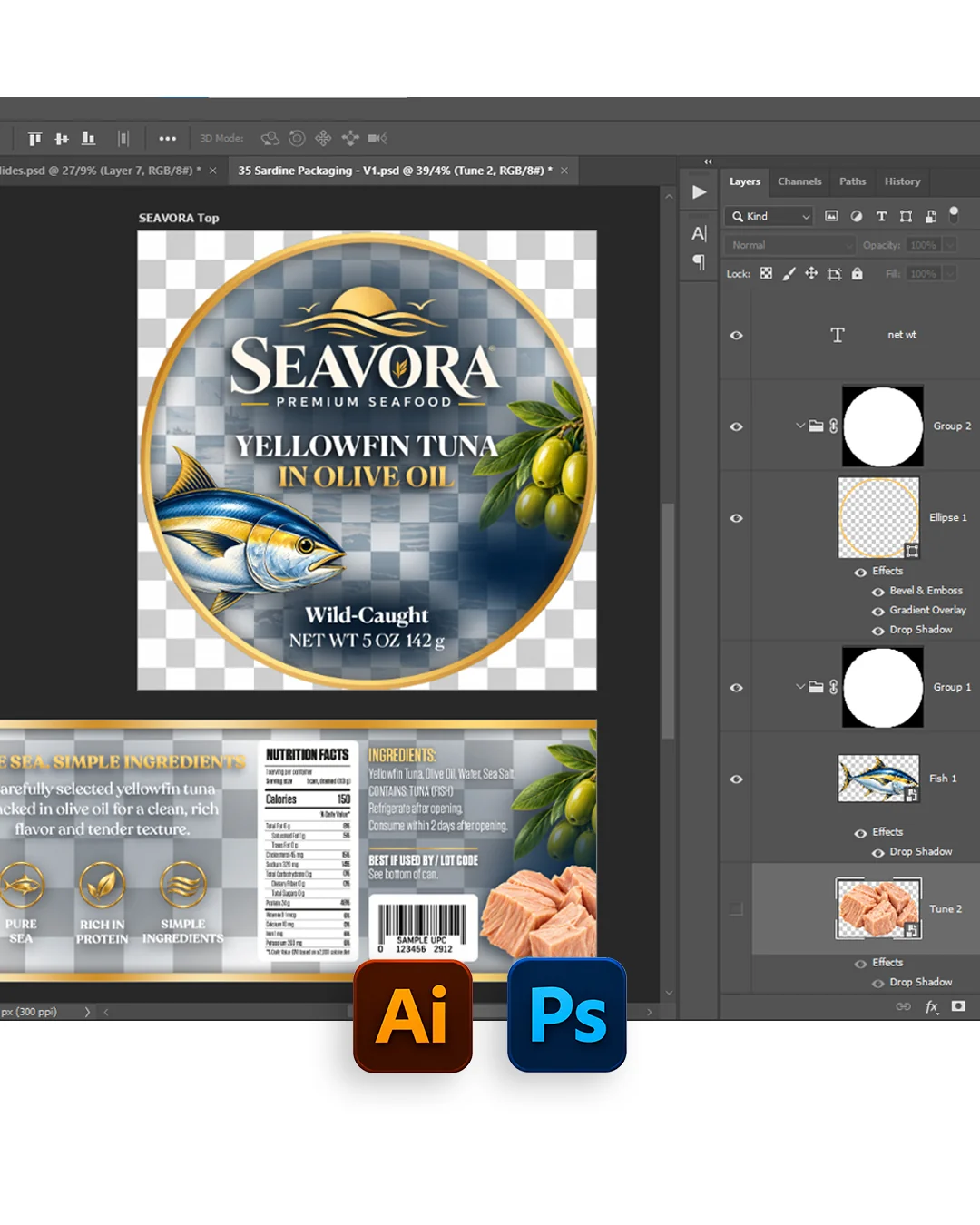
The challenge was to organize a large amount of product information within a limited label area while keeping the brand, product type, and key details clear and easy to navigate.
03 — Visual Direction
Deep Ocean Tones with Refined Gold Details
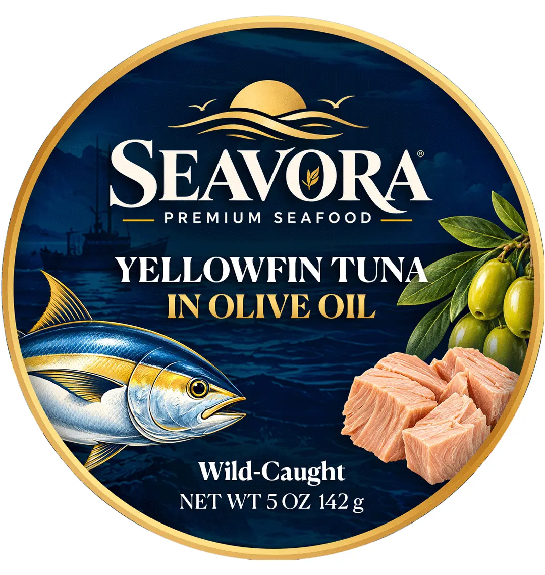
Deep navy, warm gold accents, classic serif typography, and tuna and olive imagery create a refined maritime identity with a premium and distinctive shelf presence.
04 — Packaging System
Designed Across the Can and Lid
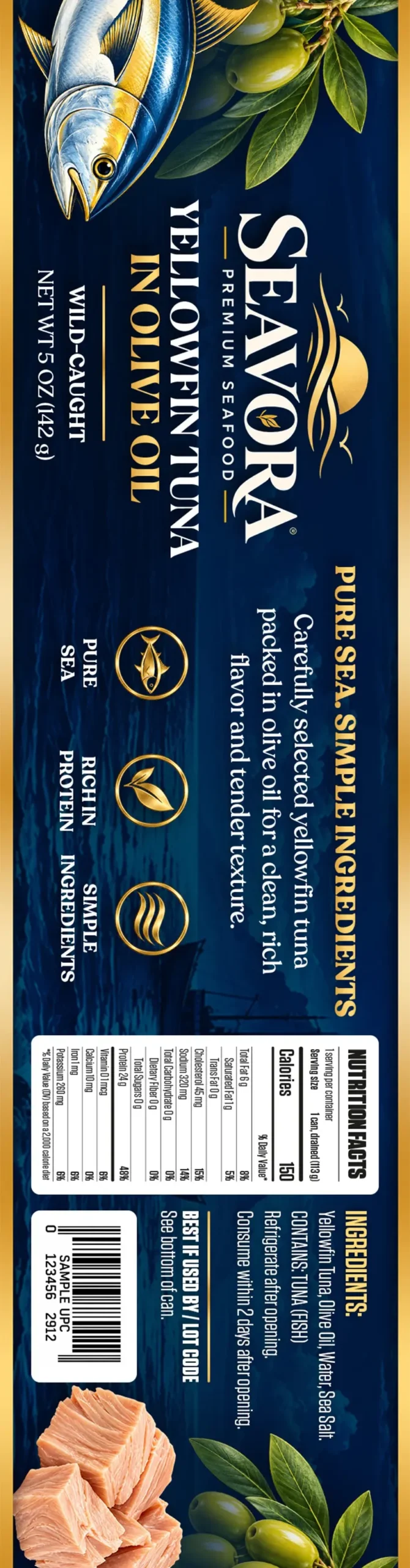
The SEAVORA identity extends across the complete canned seafood packaging system rather than focusing only on the front-facing label. The wrap-around artwork carries the brand story, product information, nutrition facts, ingredients, barcode area, and supporting communication in one continuous composition. A custom lid design extends the same navy, gold, and ivory visual language to the top of the can, creating a consistent branded experience from multiple viewing angles and strengthening product recognition throughout the packaging.