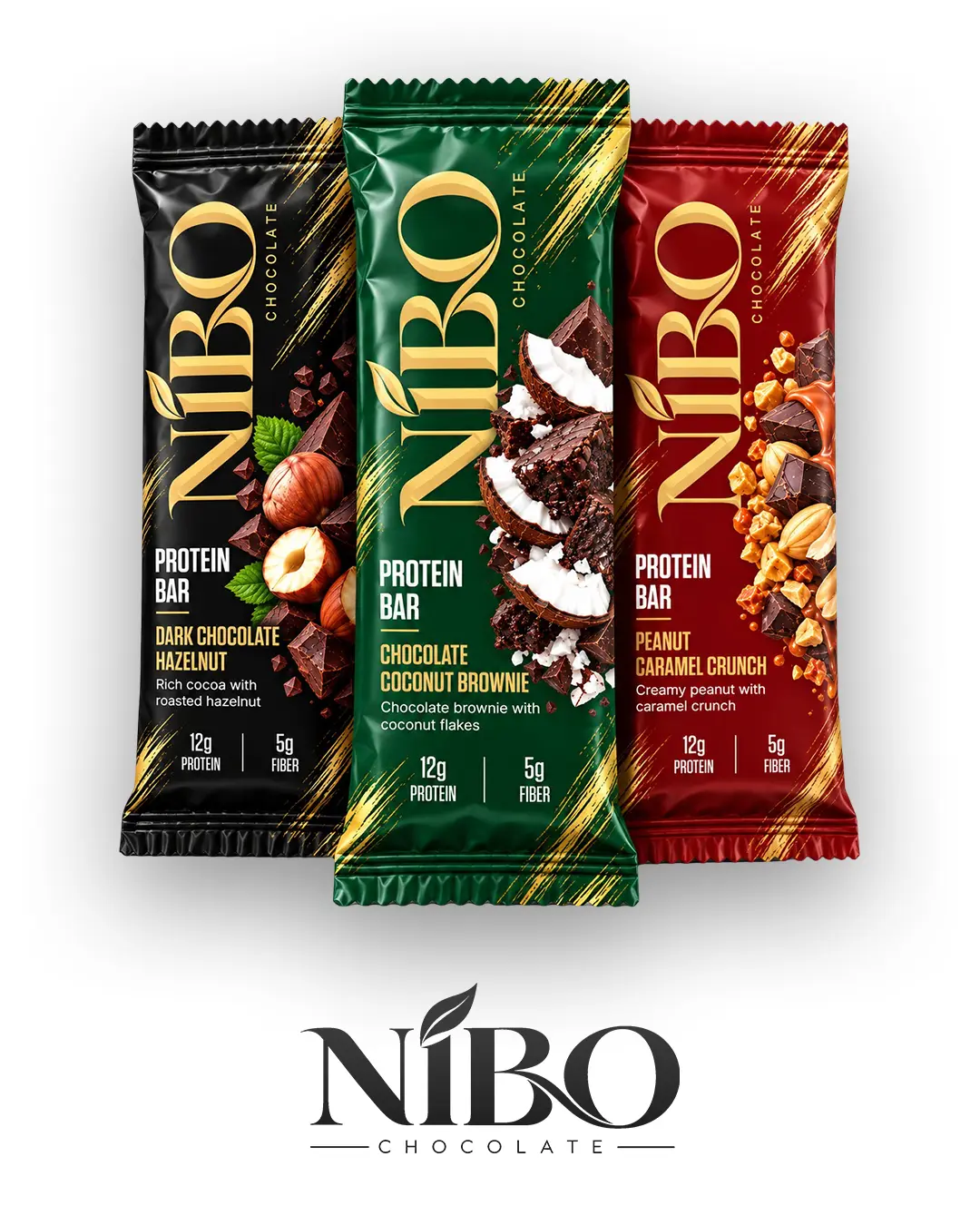
A bold protein bar packaging concept created for a three-flavor range featuring Dark Chocolate Hazelnut, Chocolate Coconut Brownie, and Peanut Caramel Crunch.
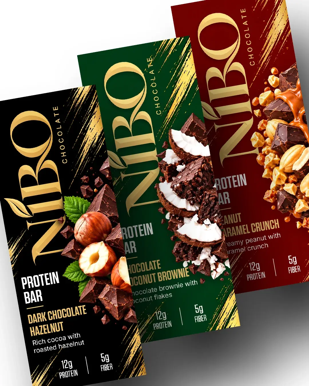
NIBO combines strong typography, rich ingredient imagery, premium gold detailing, and distinctive flavor colors to create a packaging system that feels energetic, premium, and immediately recognizable on shelf.
Color Palette
Typography
Custom Display Logotype
Tungsten
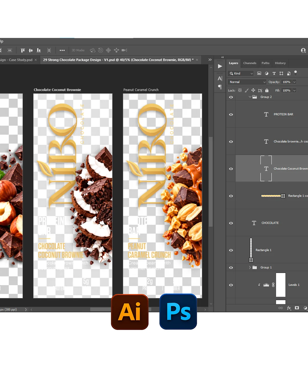
Tools Used
Deliverables
Brand Identity · Packaging Design · Flavor System · Art Direction · Packaging Artwork
PROJECT TYPE
Concept Packaging
CATEGORY
Food & Beverage / Protein Snacks
PACKAGING
Flexible Flow Wrap
Protein Bar Wrapper
SCOPE
Branding · Packaging · Art Direction
YUMMY BRANDS
01 — Project Overview
Performance Meets Indulgence
NIBO is a premium protein bar packaging concept developed around the balance between functional nutrition and indulgent flavor. The range features three varieties — Dark Chocolate Hazelnut, Chocolate Coconut Brownie, and Peanut Caramel Crunch — each combining rich ingredient imagery with clear nutritional messaging to create a product that feels both satisfying and performance-focused.
YUMMY BRANDS
02 — The Challenge
Balancing Nutrition and Flavor Appeal
Protein bar packaging often needs to communicate functional benefits such as protein and fiber while still making the product look appetizing and desirable. The challenge was to avoid a packaging style that felt overly technical or fitness-focused. Instead, the design balances strong nutritional callouts with premium chocolate imagery, bold flavor names, and rich ingredient compositions to create a more indulgent and approachable identity.
03 — Visual Direction
Bold, Premium and Ingredient-Led
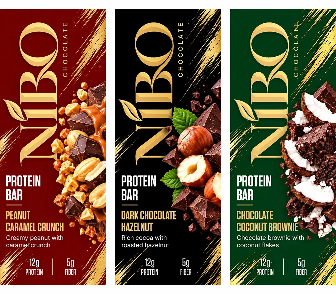
The visual direction uses dark backgrounds, metallic gold accents, large vertical branding, and highly detailed ingredient imagery to create a confident premium presence. Each flavor uses its own dominant color while maintaining the same typography, layout, and gold graphic language. This creates strong differentiation without breaking the overall NIBO brand system.
04 — Flavor System
Three Flavors, One Strong Identity
Each NIBO variety is built around a distinct flavor color and ingredient composition. Dark Chocolate Hazelnut uses a deep black base, Peanut Caramel Crunch introduces a rich red tone, and Chocolate Coconut Brownie uses a dark green palette. The flavor-specific colors make each product easy to recognize while the shared structure keeps the range visually unified.